Wednesday, December 15, 2010

final

I had a very difficult time with fitting the wreath in but i like the final result with out the wreath

Tuesday, November 30, 2010

My Pattern Design Thingie

This is the design I made it took me forever. I tried brids at first but that didnt work so i went with a more floral vine design that i made on my own. I like how it turned out. I think that it is very elegant and cute! I love how it turned out.

Thursday, November 18, 2010

Raven Design Business Card


This is my buisness card design. The first picture is the back of the card where all the information is located and the one beneath that is the front of the card with the name, logo, and website. I made the red swooshy thingies what should i call them? just to give a little color to  my card . I went with a white background because my logo didn't like cooperating with a different color so I left that alone and went to the rest of the card. It only took me 1 1/2 days which I was suprised at how easy this was compared to making the actuall logo. I think it turned out great and I am very proud of the turnout.

Tuesday, November 16, 2010

CATE logo Vs. CATE logo

I acutally made two logos for this assignment instead of just one. I couldn't decide. My personal favorite is the circle because of its simplicity, but I also love the cute little dude jumping out of the book. I think both are a nice way of adding warmth to a professional looking logo though I couldnt find the right font. I went with simple black and white with this one and maybe I will put a color version up later. I need to get onto my other assignments... Anyway I think both are great logo designs and I will leave it to you to decide. Sorry it is so small my computer does something weird if its not O.o

Thursday, November 11, 2010

Raven Design logo in color

This is my logo in color. I posted a black and white version under this with my thoughts on the project. I like how the red really stands out from the black and white. I think it turned out really well considering how it is nothing like what I had origionaly planned.

Raven Design logo in black and white

This is the logo i created for my design company. It took me quite a while to actually get an idea and make the logo with many "prototypes". I think the hardes thing about this project was how simple it needed to be. I couldnt just stick a whole bird into the logo. The leading and kerning of the letters is a bit weird. The actual graphic was very simple just five shapes. I didn't add any color to the logo but I think I will post a color version later on.

Friday, October 29, 2010

Express Yourself

When I did this project I saw many that put the words in the background but I decided to put all the words in my hair. I dont know why seemed original i guess. When I performed live trace on my picture I got no out line to my shoulders so I improvised with a simple sentence. I added bright colors such as green and pink to the background to reflect my personality and I used bright colors on the text also. I think it turned out well I only used five font and did different things with them to make them seem like I used more like caps, spacing, and color. This is me.

Tuesday, October 26, 2010

Sketch


This is what i got I think the pencil shavings were the hardest out of everything which was a surprise to me because i thought they would be overly easy. Im very happy with the turn out. YAY! Let me just add that this was a work out for my technelogical skills *if thats even a word*  THIS WASNT EASY...AT ALL!!!


Tuesday, October 19, 2010

Vase Project

This is the flower vase i went with...I had a little trouble with getting the flower onto the vase but it's there now. I think the actuall design of the flower was pretty easy but I wish the vase could have turned out a little more vase like instead of milk bottle like.

Friday, October 8, 2010

Snowboarder

Im sooo awsome I finally got this finished! I think it looks pretty professional. The pen tool was a pain but it turned out in my opinion maybe better than the tutorial...okay probably not but still. Im so happy. Yay!

Thursday, September 30, 2010

My Starbucks Logo!


This is my personal logo project. I love starbucks so that is why i choose the logo. I think the pen tool could have been more cooperative but it could have turned out worse. I really want a white mocha chip latte right now.


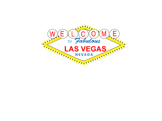
Viva Las Vegas

This is my Las Vegas sign tutorial. I thought it turned out pretty good for what I did. Umm not as much pen tool as I thought I would be using but I think that is maybe why it turned out as well as it did.

Friday, September 24, 2010

my name with paint dumped all over it!

This is my splat tutorial outcome...um it isnt as good as the one in the tutorial, but I guess it still looks pretty awsome. I thought the red and green reminded me of christmas so i decided to go with a blue and a green. Ummmm....I didn't have a good expirience picking the colors for the actuall text itself so umm...I went with purple becuase it looked the best It might be a tad bit hard to read so very sorry about that. Umm...hope you like it. Cool.

Thursday, September 23, 2010

Quote Changes

I made some changes to my quote. So sorry if I just totally blew it and now it's just a mess. I did try to make it confusing becuase Edgar Allan Poe was a very mysterious dude. I added some capital letters where they shouldn't be (Sorry grammer lovers) and I decided it would be a good idea to add some bold letters in there to. I'm sorry if it is a little to small to read...I didn't mess with my color choice. I did try to go with a darker red but it did not stand out as much. Any lighter and/or  brighter would have made it pink!

Wednesday, September 22, 2010

Spiral Tutorial

This is my spiral tutorial much like my quote how weird. I had know idea about this...just so you know. Hope you like it!

Friday, September 17, 2010

My Glyph Monster

This is my awsome monster I decided to name Toby the Destroyer of Worlds. Don't ask me why. Don't be fooled by his cuteness. He is a master of destruction. No worries though he is not here to conquer our planet...yet. He still has to find his lost gummybears. After that...well...then we can panic.

Monday, September 13, 2010

Quote

This quote is by Edgar Allan Poe who I think I captured in this seemingly odd layout. Poe could write very beautiful poetry as well. Im sorry my quote is such a head turner, but it gets the point across. I like my picture I think it looks great and  gives you a feel of the neverening uneasieness of Edgar Allan Poe. I think that the colors that I used in this quote are great for my purpose the red really stands out from the black to get my point across plus it looks awsome.

Friday, September 3, 2010

Design Elements


By Kristen

Texture
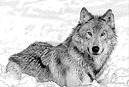
This sketch is of a wolf. The texture of the wolf seems to be furry, but it is just lines on paper.
This is called implied texture. Texture is the surface quality of a shape.

Lines
The arangement of the lines give this picture a futuristic quality. The lines of this picture gives it the balance, movement, and action.

Direction
 The direction in this picture decribes movement and seems almost to be moving
across the picture.

Shape

This dog is made up of a few shapes with addes details. Shapes are self contained areas that are made up of lines. For instance the dog's ears are triangles. The head and muzzle are circles. The body is an oval. Shapes can make many things.

Size
http://www.google.com/imgres?imgurl=http://www.bungie.net/images/Games/Halo2/Gallery/Concept/concept_ivorytower_persp.jpg&imgrefurl=http://www.freewebs.com/hypnotichippo/pictures.htm&usg=__zwfKYToBd1h8v3pbbIK50-QMtps=&h=710&w=800&sz=306&hl=en&start=121&zoom=1&um=1&itbs=1&tbnid=YQ13WPgQ8L4f-M:&tbnh=127&tbnw=143&prev=/images%3Fq%3Dperspective%2Bdrawing%26start%3D108%26um%3D1%26hl%3Den%26safe%3Dactive%26sa%3DN%26ndsp%3D18%26tbs%3Disch:1

The person in the front looks bigger than the people in the back due to perspective. Size is simply the relationship of the area occupied by shape to that of another.

Color
http://www.google.com/imgres?imgurl=http://www.tuxpaint.org/gallery/antonis/Color_Smudges.png&imgrefurl=http://www.tuxpaint.org/gallery/%3Fshow_artist%3DANTONIS&usg=__uQhTV26ndgChkmHr9Mu-TlNH1_c=&h=376&w=448&sz=293&hl=en&start=7&zoom=1&um=1&itbs=1&tbnid=LXCZR_D3kHjVuM:&tbnh=107&tbnw=127&prev=/images%3Fq%3Dcolor%26um%3D1%26hl%3Den%26safe%3Dactive%26tbs%3Disch:1


Color is the hue. This picture has many colors.

Value

Value is just tone. This picture shows many tones of blues, or many different shades of blue.


Wednesday, August 25, 2010

biography

My name is Kristen. I have one dog named Rocky who does nothing but sleep. My favorite color is sky blue. My hobbies include drawing and anything that has to do with drawing or art. I practice drawing everyday and I hope to pursue a career in art someday. My favorite music is pop. I love amusement parks. I also ride horses when I can. My favorite food is pizza. My favorite soda is Coke. My favorite book is My Sisters Keeper and I do not have a favorite movie.