Thursday, September 30, 2010
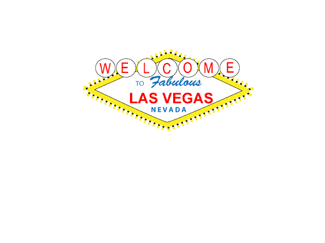
Viva Las Vegas
Friday, September 24, 2010
my name with paint dumped all over it!
Thursday, September 23, 2010
Quote Changes
Wednesday, September 22, 2010
Spiral Tutorial
This is my spiral tutorial much like my quote how weird. I had know idea about this...just so you know. Hope you like it!
Friday, September 17, 2010
My Glyph Monster
Monday, September 13, 2010
Quote
Friday, September 3, 2010
Design Elements
By Kristen
Texture
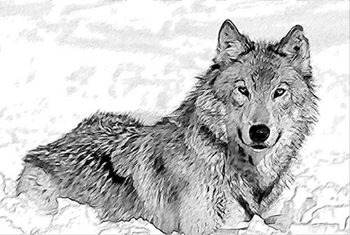
This sketch is of a wolf. The texture of the wolf seems to be furry, but it is just lines on paper.
This is called implied texture. Texture is the surface quality of a shape.
Lines
The arangement of the lines give this picture a futuristic quality. The lines of this picture gives it the balance, movement, and action.
Direction
across the picture.
Shape
This dog is made up of a few shapes with addes details. Shapes are self contained areas that are made up of lines. For instance the dog's ears are triangles. The head and muzzle are circles. The body is an oval. Shapes can make many things.
Size
http://www.google.com/imgres?imgurl=http://www.bungie.net/images/Games/Halo2/Gallery/Concept/concept_ivorytower_persp.jpg&imgrefurl=http://www.freewebs.com/hypnotichippo/pictures.htm&usg=__zwfKYToBd1h8v3pbbIK50-QMtps=&h=710&w=800&sz=306&hl=en&start=121&zoom=1&um=1&itbs=1&tbnid=YQ13WPgQ8L4f-M:&tbnh=127&tbnw=143&prev=/images%3Fq%3Dperspective%2Bdrawing%26start%3D108%26um%3D1%26hl%3Den%26safe%3Dactive%26sa%3DN%26ndsp%3D18%26tbs%3Disch:1
The person in the front looks bigger than the people in the back due to perspective. Size is simply the relationship of the area occupied by shape to that of another.
Color
http://www.google.com/imgres?imgurl=http://www.tuxpaint.org/gallery/antonis/Color_Smudges.png&imgrefurl=http://www.tuxpaint.org/gallery/%3Fshow_artist%3DANTONIS&usg=__uQhTV26ndgChkmHr9Mu-TlNH1_c=&h=376&w=448&sz=293&hl=en&start=7&zoom=1&um=1&itbs=1&tbnid=LXCZR_D3kHjVuM:&tbnh=107&tbnw=127&prev=/images%3Fq%3Dcolor%26um%3D1%26hl%3Den%26safe%3Dactive%26tbs%3Disch:1
Value is just tone. This picture shows many tones of blues, or many different shades of blue.
http://www.google.com/imgres?imgurl=http://www.bungie.net/images/Games/Halo2/Gallery/Concept/concept_ivorytower_persp.jpg&imgrefurl=http://www.freewebs.com/hypnotichippo/pictures.htm&usg=__zwfKYToBd1h8v3pbbIK50-QMtps=&h=710&w=800&sz=306&hl=en&start=121&zoom=1&um=1&itbs=1&tbnid=YQ13WPgQ8L4f-M:&tbnh=127&tbnw=143&prev=/images%3Fq%3Dperspective%2Bdrawing%26start%3D108%26um%3D1%26hl%3Den%26safe%3Dactive%26sa%3DN%26ndsp%3D18%26tbs%3Disch:1
The person in the front looks bigger than the people in the back due to perspective. Size is simply the relationship of the area occupied by shape to that of another.
Color
http://www.google.com/imgres?imgurl=http://www.tuxpaint.org/gallery/antonis/Color_Smudges.png&imgrefurl=http://www.tuxpaint.org/gallery/%3Fshow_artist%3DANTONIS&usg=__uQhTV26ndgChkmHr9Mu-TlNH1_c=&h=376&w=448&sz=293&hl=en&start=7&zoom=1&um=1&itbs=1&tbnid=LXCZR_D3kHjVuM:&tbnh=107&tbnw=127&prev=/images%3Fq%3Dcolor%26um%3D1%26hl%3Den%26safe%3Dactive%26tbs%3Disch:1
Color is the hue. This picture has many colors.
Value
Value is just tone. This picture shows many tones of blues, or many different shades of blue.
Subscribe to:
Posts (Atom)


