Monday, October 17, 2011

Tire tutorial


This is the tire I modeled following the tutorial. I thought the most difficult thing were the spokes which did not feel like working for me when I smoothed them so they look just a tad bit different than what they looked like in the tutorial. I think the treads were really cool to see how that worked. My tire is like an off road tire because the treads are really big.

Wednesday, October 5, 2011


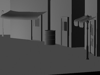
These are a few updated pictures from my alley scene. I added a few doors an oil-trash can thingie. I added more detail to my lights I am really liking modeling. I am currently having some trouble with the windows but I will figure that out before I texture anything. I can't believe how good this looks. I used a load of polygons and I'm really liking those but nurbs aren't that difficult yet I had a few problems with the wires. The oil barrel was a bit tricky but I got through it.

Screw Driver Tutorial


This is the screwdriver I modeled with the tutorial. It was fairly easy. I'm really liking modeling. This took me about a day to do so I think it is a pretty awesome lookin screw driver.

Thursday, September 22, 2011

alley way pics

A close up in perspective of my alley way. This shot shows some of my modeled light posts, awnings, and telephone wires. So far I think it looks really awesome!


A midshot of my alley way. I really like the view you can see my building and thier different sizes and how it forms to make a scene.


A long shot of my alley way. You can see the plane that the whole scene rests upon and the little atmosphere bubble thing. You can see how all the props make the scene look more complete.


Wednesday, September 14, 2011

MY 1ST GIF!!!

This is my first gif gave me a ton of problems thanks Able! Now I can do this. I first did all the text on seperate documents and had to move them to one document and do all the animation stuff to get this right. The tutorial sort of confused me but now this is done!!!

Monday, September 12, 2011

Google Map Parody!

This is a parody of google maps. I used some different tools from last year to create this. The tutorial was simple and it took me only a few days.

Haunted Mansion!

Before
After
This is my haunted mansion picture I just used previous expirience from last year to create this.

Friday, September 9, 2011

Okay...

So im having a little problem posting my projects from class onto here. Im currently posting this from home. Im going to try to get my projects up on Monday.

Tuesday, August 23, 2011

A New Year ! :D ANIMATION!!!

      So now begins a new chapter in my life. Last year I took Graphic Design and D.I.M. to get ready for this class, Animation! My name is Kristen I'm 15 years old and I'm a sophomore. I love animation and hope to someday have a career in this field. I have a brother who is 12. I have a new kitten we got this summer and a dog (he's a chihuahua). I can't wait for this year to begin. I only have one problem with summer ending. I can't sleep in 'till noon anymore. :'( I love art, drama, and graphic design!

Monday, May 23, 2011

Polaroid Cover Page

So this is my polaroid cover page. I had Sara give me a very useful tip about a polaroid generator and so I did not have to make about 30 polaroids manually. The clipping mask was very easy at this point and I had no trouble with it. The background for the clipping mask was just arranging the polaroids and bringing them over from thier documents.

Tape and Curl and Signature Sheet

Okay so now blogger is working on a different comupter! Sorry for the wait. This is my combined tape and curl plus reflection sheet combo all-in-one. I actually did this before it was assigned to us. I really thought that the color scheme and my pattern here would go nicely in my book.

Tuesday, May 10, 2011

Tape and Curl

This is a different version of the tape and curl that I found online. I did this before the tutorial was put up on tiger but I am just posting it now. I thought the tutorial I did was  easier than the one that was posted on tiger, but this was fun and this is an autograph sheet for my memory book.

Tuesday, April 5, 2011

Never Forget


So this one was not a walk though the park for me. Yes, it was easy since it was all review.

Wednesday, March 30, 2011

Tree Carving

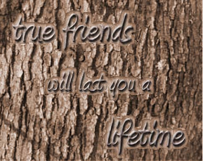
This is what happens when you use a smaller font for the tree carving. I wish that the filter>distort>ocean ripple did
what it was supposed to do but it didn't feel like working properly today so I added the carved outline. I knew that this tutorial wasn't going to be very cooperative. I wish the text was a bit more visible.

Friday, March 25, 2011

NEW YORK!

I loved this tutorial. It was sooo useful. I think the picture of New Years in Times Square looked
great for my clipping mask. I think the bright yellow adds life to the graphic and the drop shadow
gives more dimension. I could use this for many things and it's fun.
http://lodging.uptake.com/blog/new-years-eve-on-times-square-new-york-new-york.html

Guitar Design!

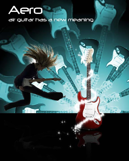
This is what I came up with for my guitar design. I went with a red guitar because I thought
it looked awesome. I went with a more teal color for the background intead of the blue background.
I added a "glittery" effect and added the reflection. I added the girl instead of a dark shillouette
because I wanted it to look more realistic. I like how simple it was to do this tutorial.

Friday, March 11, 2011

MOVIE POSTER!!!

This was a lot of fun to do. It was very time consuming and definately gave me a challange.
I thought that my biggest concern was how to actually get the power ball onto the movie poster
and into my actor's hands. I came up with the idea at the last second to use the smart radius to mask it.
It worked!!! So since the tutorial told me to put it on a black background that confused me but I was able to make it look
alright. I did the text at the bottom by using duplicates of the text layers and use the motion blur. I also converted some text to  create the credits. I went on the internet and found a rating box thingie that I inverted the colors to fit into my poster. I thought the creation of the powerball was a simple tutorial to follow except for the part to fit it in to the movie poster. I used a kid playing basketball because I had trouble finding some one looking like they were holding this powerball. I added a shilouette of a lady at the very end and added some glowing effects. I made the background myself using the glow, gradients, and lines. I know this is really long I'm just really proud I finally got this done!

Wednesday, March 9, 2011

Vintage Polaroid

So this is my vintage polarioid. I had trouble getting the tutorial website to work more than
the tutorial itself. I think the tutorial was very easy. It only took me a couple of days to finish.
Other than the technical issues, I enjoyed this tutorial. I added "The Dreamer" text under it
because that is what I see myself as. I used an old school photo from last year and changed it up a bit.

Monday, March 7, 2011

FINISHED Poster

It is now finished! yay! So, this took me a while to get right. I hope it looks okay. I think the hardest part was the stuff in the background the text and the pup were pretty easy to do. I think it looks good.

Friday, March 4, 2011

UNFINISHED! Retro Poster

This is what I have so far...its not finished yet, but I'll get that up as soon as I can.

Monday, February 14, 2011

hair mask tutorial


So this is what happened...I think it may not be as great as the video, but im happy It doesnt look too just sad. I think when it comes to hair masking I might need a little practice.

Friday, February 11, 2011

Makeover!

Original

After

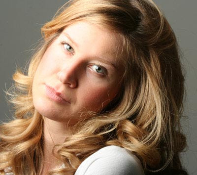
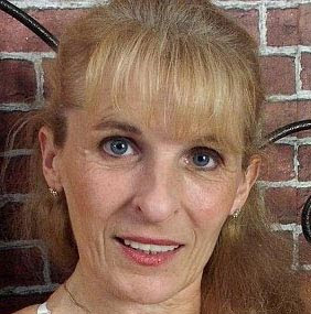
So I changed my hair and eye color. I added color to my shirt using the color match tool. I added eye shadow, eye liner, and blush to my self. I took out a small bump in my nose and changed my neck just a bit to get out that stange tilt. I put a smile on my face. I also changed my shirt color to green. I think that the original is better but this was fun and I enjoyed this. I think the shirt I was using wasn't the best to do a color match on so thats why it's a little weird. I think that I would look good with green eyes...hmm...

Wednesday, February 2, 2011

Photoshop Makeover Tutorials

Nose Tutorial
Before

After

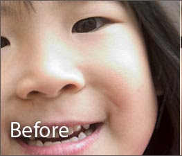
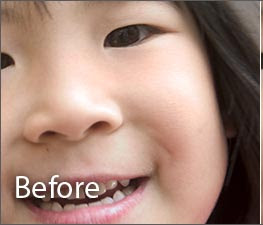
This tutorial took like five minutes it was so easy. I Thought this is a very effective tutorial. The changes are dramatic.

Hair tutorial
Before
After

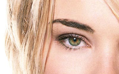
I thought the pink highlights would be cute with her green eyes so I switched up the tutorial a bit. I think this can really look great if you take your time. I've tried this about four or more times now. If you want more natural highlights get every little detail possible and take your time! I love how this turned out.


Before

After

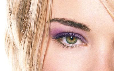
I think this tutorial was one of my favorites for some reason I really love giving people makeovers...I thought it wasn't too time consuming and it really looks like eye shadow and not just fake painted on make up. I really like this.
Before

After

This tutorial was simple and easy. I think it changes the photo alot.

Before

After

I've done something like this before and this is not hard or anything but it really makes a difference. It may sometimes look like plastic or blurred if you overdo it (from expirience) but this didn't take too long and the difference is huge.
Before

After

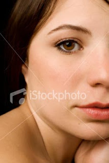
This tutorial was pretty simple. I think that by taking away that shiny highlight, your eyes are drawn to the picture, and that is exactly what you are supposed to look at. Oh, and I know that is says before. It is really the after picture.
Before

After

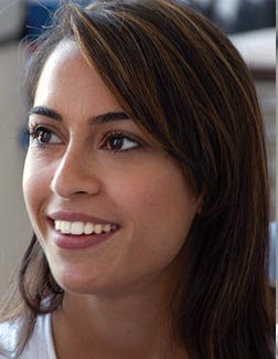
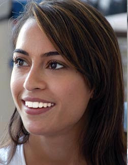
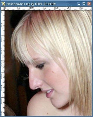
I just took away her beauty mark using the spot heal tool. The tutorial was simple. I don't think I would have known she had a beauty mark in the first place. I don't think this looks fake either. It looks very natural.