Wednesday, March 30, 2011

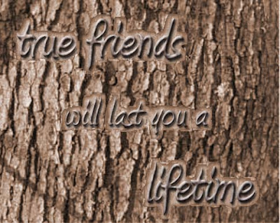
Tree Carving

This is what happens when you use a smaller font for the tree carving. I wish that the filter>distort>ocean ripple did
what it was supposed to do but it didn't feel like working properly today so I added the carved outline. I knew that this tutorial wasn't going to be very cooperative. I wish the text was a bit more visible.

Friday, March 25, 2011

NEW YORK!

I loved this tutorial. It was sooo useful. I think the picture of New Years in Times Square looked
great for my clipping mask. I think the bright yellow adds life to the graphic and the drop shadow
gives more dimension. I could use this for many things and it's fun.
http://lodging.uptake.com/blog/new-years-eve-on-times-square-new-york-new-york.html

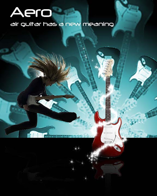
Guitar Design!

This is what I came up with for my guitar design. I went with a red guitar because I thought
it looked awesome. I went with a more teal color for the background intead of the blue background.
I added a "glittery" effect and added the reflection. I added the girl instead of a dark shillouette
because I wanted it to look more realistic. I like how simple it was to do this tutorial.

Friday, March 11, 2011

MOVIE POSTER!!!

This was a lot of fun to do. It was very time consuming and definately gave me a challange.
I thought that my biggest concern was how to actually get the power ball onto the movie poster
and into my actor's hands. I came up with the idea at the last second to use the smart radius to mask it.
It worked!!! So since the tutorial told me to put it on a black background that confused me but I was able to make it look
alright. I did the text at the bottom by using duplicates of the text layers and use the motion blur. I also converted some text to  create the credits. I went on the internet and found a rating box thingie that I inverted the colors to fit into my poster. I thought the creation of the powerball was a simple tutorial to follow except for the part to fit it in to the movie poster. I used a kid playing basketball because I had trouble finding some one looking like they were holding this powerball. I added a shilouette of a lady at the very end and added some glowing effects. I made the background myself using the glow, gradients, and lines. I know this is really long I'm just really proud I finally got this done!

Wednesday, March 9, 2011

Vintage Polaroid

So this is my vintage polarioid. I had trouble getting the tutorial website to work more than
the tutorial itself. I think the tutorial was very easy. It only took me a couple of days to finish.
Other than the technical issues, I enjoyed this tutorial. I added "The Dreamer" text under it
because that is what I see myself as. I used an old school photo from last year and changed it up a bit.

Monday, March 7, 2011

FINISHED Poster

It is now finished! yay! So, this took me a while to get right. I hope it looks okay. I think the hardest part was the stuff in the background the text and the pup were pretty easy to do. I think it looks good.

Friday, March 4, 2011

UNFINISHED! Retro Poster

This is what I have so far...its not finished yet, but I'll get that up as soon as I can.